Curing Poverty Looks So Easy
Suppose that before welfare and charity is implemented we have an income distribution that is some type of bell shaped curve; that is we have more people near the median income that at the extremes. In order to match something close to the current situation, we use a curve that dies off more gradually towards the extremes than the classic normal distribution you find in the statistics books.
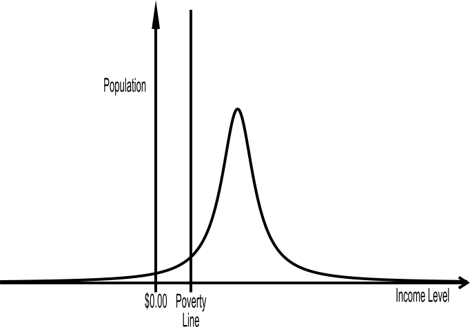
Consider the following curve:

I roughed together a curve that is meant to be qualitatively similar to a real situation. It doesn't have to be exact for the discussions that follow. The poverty line of $9000 I set is a bit above that used by HHS for a single adult. Note that while the HHS figure is assuming some entitlements to go along with that income, it is also assuming the higher prices we all pay due to the high taxes needed to pay for such entitlements. I don't know where exactly we should set the poverty line, but as long as it is significantly below the median income, all the arguments below follow.
Note also that I have a significant number people with a negative income. This is meant to represent those who need special care, such as orphans, the severely mentally retarded or insane, the bedridden, and those who need expensive medical treatments.
Now, suppose we decide that poverty, that is living below the poverty line, is unacceptable. How expensive would it be to take from the more fortunate and bring everyone up at least to the poverty line?
We will first consider the simplistic approach of looking at everyone's income (including special needs) and giving them the difference between their current income and the poverty line.
If we could take a bit of income from the upper income people and give it too the poor to get them up to the poverty line, we could eliminate poverty in theory. How expensive would this be?
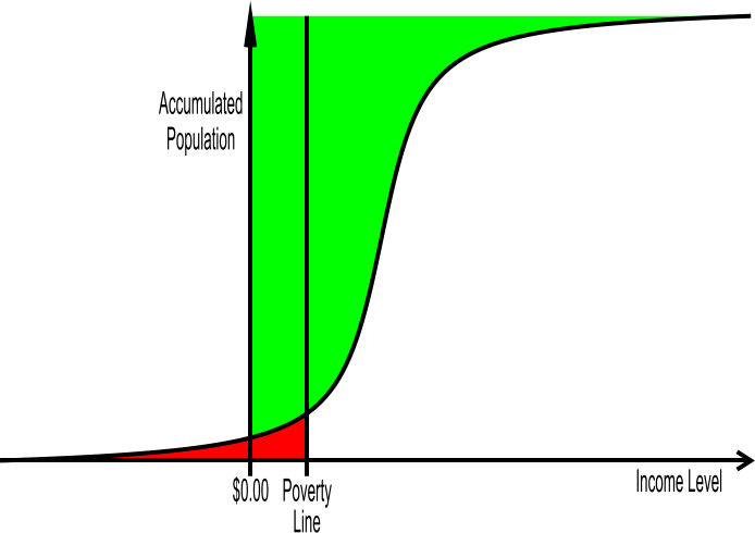
To determine the expense, we convert the bell shaped curve into an S curve. The bell curve represents all those living at a particular income level. The S curve will represent all those at or below a particular income level. We get the S curve by going from left to right and adding up the bell curve values. (For those who remember their calculus, the S curve is the integral of the bell curve.) The result is Figure 2.

The total national income level is the area to the left of the S curve. That is, this area is the sum of people times their respective income levels. This is represented in green on Figure 2. The theoretical cost of bringing everyone up to the poverty line is the red area on the figure. This is tiny compared to the green area! Even if my original income estimate was highly optimistic, the red area would still be small in the corrected graph. This is especially true given that the graph continues farther to the right; there are a small number of people with very huge incomes!
As long as our poverty line is set significantly below the median income, the theoretical amount needed to be able to cure poverty is not all that much. A fairly mild tax system should be able to do the job. Indeed, it looks like private charity should be able to do the job.
But things are not so simple.


